
Add a Pop Over
Create a button that opens a popup containing text, images, and other page components.
A Pop Over adds a button that opens a popup containing other components. Use it for supporting details that visitors can choose to open, such as an explanation or a short set of instructions.
Add the popup
- Select Add Content in the website editor.
- Drag Pop Over from Content into your page.
- Select the component and enter a descriptive Button Label.
- Turn on Force Open while editing so the popup content stays visible.
- Under Content, select Add Content and choose a component for the popup.
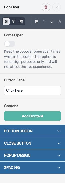
Add and edit text, images, and other components inside the popup just as you would in a page section. Force Open is an editor aid only; it does not force the popup open for visitors.
Style the button and popup
Under Button Design, choose Align, Size, and Full Width. Size and Full Width can be adjusted for different screen sizes using their device controls. Style uses your site’s Standard or Highlight button design.
Under Close Button, set Close Button Background and Close Icon Color. Keep the close control easy to see.
Under Popup Design, set Popup Background, Popup Border, and Popup Text Color. These control the popup surface; individual components inside it can also have their own settings.
Spacing > Margin controls the space around the trigger button on the page.
Check the visitor experience
Open Preview to test the button. It opens a dialog over the page, and the close button dismisses it. Check longer content and mobile layouts: the popup can scroll when its content exceeds the available height.
Select Publish when the button, content, and close control work as intended.