
Add a Block Grid
Create a responsive grid of content blocks with shared styling and optional block links.
The Block Grid component arranges content blocks in a responsive grid. Use it for service cards, topic links, or other groups that should share a consistent design.
Add and organize blocks
- Select Add Content in the website editor.
- Drag Block Grid from Layout into your page.
- Select the component and choose a block from the Blocks list.
- Use Add Content to place components inside that block.
- Edit the added content on the page.
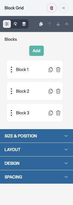
Use Add for another block. Each block row has controls to copy or remove it, and a drag handle for changing the order. Removing a block also removes its contents.
Customize an individual block
Select a block in the list to adjust its Content and Link. Use the spacing controls on the components inside the block to adjust their margins and padding.
Turn on Override Grid Background to choose a background for that one block. Otherwise, it follows the grid’s shared background.
A block Link makes the whole card a link in the published page. Use it when the card has one destination; avoid placing competing links or controls inside a fully linked card.
Set the grid layout
Under Size & Position, use Width, Align, Content Align, and Min Height. Content Align positions content within each block when there is extra vertical space.
Under Layout, set Columns and Block Spacing. The initial layout uses three columns on desktop, two on tablet, and one on mobile. Use the device controls to adjust the layout.
Under Design, set the shared Box Shadow, Shape, Background, and Border. Under Spacing, Block Padding controls the space inside each card, and Margin controls space around the grid.
Preview and publish
Check desktop, tablet, and mobile layouts. Use Preview to test any whole-card links and make sure all text fits, then select Publish when ready.